|
|
|
|
Note: If the property already exists in the system, and you only want to change/add an images to the property values, skip to Step 6.
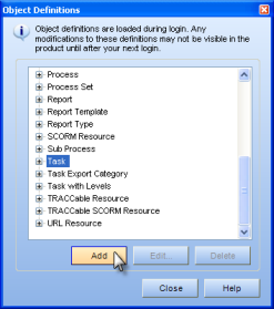
Select Tools > Object Definitions from the main menu. The Object Definitions dialog appears.
Click on the object you want to add a property for. In the example below, the "Task" object has been selected.
Click the Add button. The Property Definitions dialog appears.
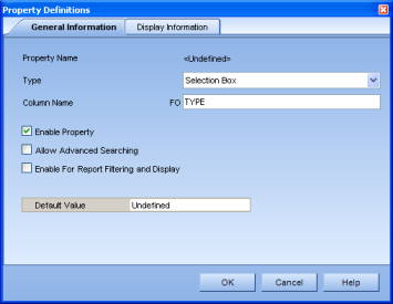
On the General Information tab choose "Selection Box" from the Type dropdown menu. "Selection Box" must always be chosen to customize an icon for a property value.
Enter a Column Name.
Check the Enable Property checkbox.
Click on the Display Information tab.
Enter the Property Name as you'd like it displayed in the Properties section. In this example, the value is called "Type" to define a type of task.
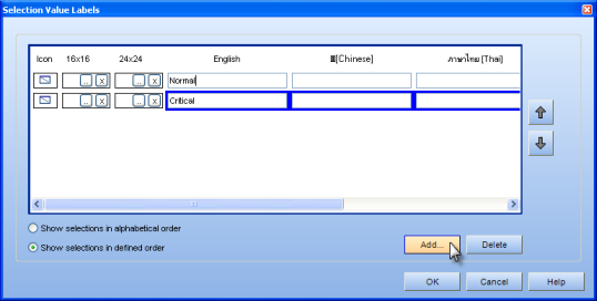
Click on the Selection Value Labels... button. The Selection Value Labels dialog appears.
Click the Add... button to add a property value. Since two property values are added in this example, the Add... button was clicked twice.
Enter the names of the property values in the "English" fields. You can switch between rows by clicking directly on the text field. In this case, the first property value has been named "Normal" and the second has been named "Critical." Note: It is recommended that a value with a no image (such as "default" or "normal") is included, since you will not be able to change the property back to its original appearance if there is no option to do so.
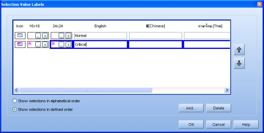
Click on the Ellipsis button  under the 16x16 column and choose a 16x16 size image from your computer.
Next, click on the Ellipsis button under the 24x24 column and choose the identical image in a 24x24 size.
In this example, the "Normal" property has been left blank, meaning this property will set the icon to look like its default image. A pink star icon has been added to the "Critical" property, and you can see a preview of how the icon will look in the "Icon" row.
When you are finished adding all your properties and icons, you can then decide on how you'd like them to be ordered in the dropdown menu, which will appear in the Properties section. If you would like them to appear alphabetically, click on the Show selections in alphabetical order radio button. You can also put them in your own order by clicking on a property, then using the up and down arrows to arrange the values. Be sure the Show selections in defined order radio button is selected.
To delete a value, select it, and click the Delete button.
Click the OK button when you are finished.
Click the OK button on the Property Definitions dialog.
Click the Close button on the Object Definitions dialog.
Your newly customized icon is now saved, and it should appear in the Process Manager when you click on a task. (If the value does not appear, be sure that you have enabled the property value by clicking on the Enable Property checkbox in the Property Definitions dialog (Step 2). If the value still does not appear, log out and log back in to TRACCESS.
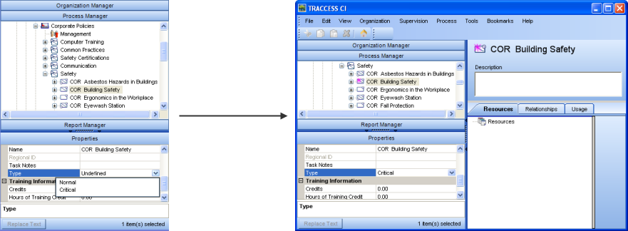
Select the object in the Process Manager to view the new property. In this example, a task is selected, and the "Type" property now appears in the Properties section. Its value appears as "undefined until a value is chosen.
Click on the property and choose a value from the dropdown menu. In this example, the values are "Normal" and "Critical." When "Critical" is chosen, the task icon changes, appearing with a pink star.
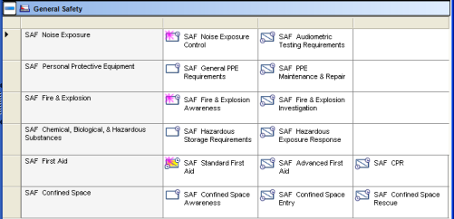
Learners who are assigned with this task will see this task with the pink star. In the image below, you can see in the learner's context view the tasks that have been flagged with a punk star, indicating that these tasks are critical and should be completed first. The star also appears on the task icons in the learner's My Job tree.
Additional Help:
Interpret Customization of Icons by Property Value
