|
|
|
|
Learners and managers can add charts to their TRACCESS Dashboard. An Employee can add a maximum of ten charts. For detailed info on charts, visit About Charts.
Note: Charts must be enabled by the System Owner before Employees can view and add charts.
To Add a Chart as a Learner:
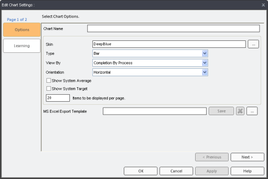
Click Home > Learner Chart. (This option is only enabled when you are viewing the TRACCESS Dashboard.) The Edit Chart Settings dialog appears:
First, edit the Options for your chart—these can be changed at anytime.
Chart Name - Type in a unique chart name. The name appears on the chart's tab on the TRACCESS Dashboard. It is recommended to use a unique name, especially if you plan to have more than one chart.
Skin - Click on the ellipsis button to view the available skins, and click on the skin you'd like to use.
Type - Choose a type of chart: Bar, Bubble, Line, or Point.
View by - Choose how to view your chart data—more info.
Orientation - Choose to display your chart data Horizontally or Vertically.
Show System Average - Displays the System Average line in your chart. This option is grayed-out if it has not been enabled by a System Owner in Dashboard Layout.
Show System Target - Displays the System Target line in your chart. This option is grayed-out if it has not been enabled by a System Owner in Dashboard Layout.
Items to be displayed per page - Sets how many items can be displayed per page. The maximum is 100. A track bar appears if all the items cannot fit on one page.
MS Excel Export Template - You can add a template to be used to export your chart to Excel.
Click Next > button. The Learning page appears:
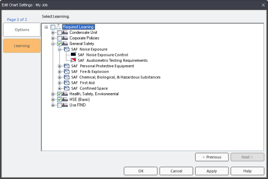
Expand your Assigned Learning tree(s) and select the Processes you'd like to display in your chart. You cannot select Process Sets, Sub Processes, or Tasks.
Click OK to save your changes.
To Add a Chart as a management role:
Click on Home > Supervision Chart. (This option is only enabled when you are viewing the TRACCESS Dashboard.) The Edit Chart Settings dialog appears.
Configure the Options page—these can be changed at anytime.
Chart Name - Type in a unique chart name. The name appears on the chart's tab on the TRACCESS Dashboard. It is recommended to use a unique name, especially if you plan to have more than one chart.
Skin - Click on the ellipsis button to view the available skins, and click on the skin you'd like to use.
Type - Choose a type of chart from the dropdown menu: Bar, Bubble, Line, or Point.
View by - Choose how to view your chart data—more info.
Orientation - Choose to display your chart data Horizontally or Vertically.
Show System Average - Displays the System Average line in your chart. This option is grayed-out if it has not been enabled by a System Owner in Dashboard Layout.
Show System Target - Displays the System Target line in your chart. This option is grayed-out if it has not been enabled by a System Owner in Dashboard Layout.
Items to be displayed per page - Sets how many items can be displayed per page. The maximum is 100. A track bar appears if all the items cannot fit on one page.
MS Excel Export Template - You can add a template to be used to export your chart to Excel.
Click the Next > button. The Organization Units page appears:
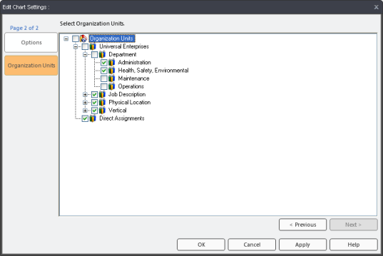
Expand the Organization Units tree(s) and select the Org Units you'd like to include in your chart.
Click the Next > button (if applicable; otherwise, skip to step 8). The Learning page appears:
Note: The Learning page only applies to View By options that do not allow Org Units to be viewed in charts.

Expand the Learning tree(s) and select the Processes to be included in the chart.
Click OK to save your changes.
Additional Help:
