Add/Edit Learner Charts to Dashboard Content
To add or edit a Learner chart to Dashboard content:
-
Select Tools > Dashboard Content. A dialog box appears.
-
Click the Chart tab.
-
Click on an Org Unit name from the tree in the left pane. All the Learners within this Org Unit and all of its child Org Units will see this chart.
-
Click on the checkbox beside the Org Unit to enable the Chart(s) for this Org Unit.
-
Select a language from the Select Language to Edit dropdown menu, located in the right pane.
-
Click the Add  icon under Learner Charts. Click the Edit
  icon for editing an existing chart. The Edit Chart Settings dialog appears.

-
First, edit the Options for your chart—these can be changed at anytime.
Chart Name - Type in a unique chart name. The name appears on the chart's tab on the TRACCESS Dashboard. It is recommended to use a unique name, especially when adding similar charts.
Skin - (Not available for Qualification Summary) Click on the ellipsis button to view the available skins, and click on the skin you'd like to use.
View by - Choose how to view your chart data—more info.
Type - (Not available for Qualification Summary) Choose a type of chart: Bar, Bubble, Line, or Point.
Orientation - (Not available for Qualification Summary) Choose to display your chart data Horizontally or Vertically.
Show System Average - Displays the System Average line in your chart. This option is not available if it has not been enabled by a System Owner in Dashboard Layout.
Show System Target - Displays the System Target line in your chart. This option is not available if it has not been enabled by a System Owner in Dashboard Layout.
Items to be displayed per page - (Not applicable for Qualification Summary) Sets how many items can be displayed per page. The maximum is 100. A track bar appears if all the items cannot fit on one page.
MS Excel Export Template - You can add a template to be used to export your chart to Excel.
-
Click Next > button. The Learning page appears.

-
Expand the Learning tree(s) and select the Processes you'd like to display in the chart. You cannot select Process Sets, Sub Processes, or Tasks.
-
Click Next > button. The Filters page appears.
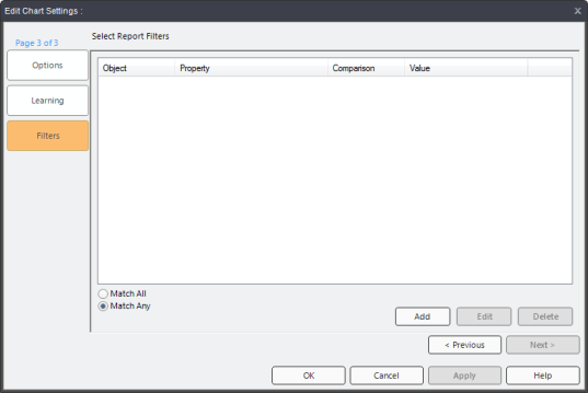
-
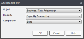
(Optional) Click the Add button. The Add Report Filter dialog appears.
-
(Optional) Choose items from the dropdown menus and click OK. These selections will refine the data that appears in the chart. This works similarly to the Reports Filter. You can add as many filters as you want.
-
Click OK.
The chart is now listed under Learner Charts in Dashboard Content and will appear on Learner Dashboards.
Note: Charts will only appear on the TRACCESS Dashboard if they are set to appear. This is configured in the Dashboard Layout editor.
Additional help:
Dashboard Content: Detailed Overview
Adding Supervisor Charts to Dashboard Content
